You may have noticed – this season’s theme of Culprit Sessions posters is a tribute to old movie posters. Because we’re a little bit lazy (by “we” I mean “me”), we’re not focusing on any particular genre or period of movie poster, but instead on a selection of those that best personify the Culprit aesthetic – a melange of LA, 60’s, 70’s, and even some 80’s Hollywood, some smarminess, some sex appeal, and a lot of sun soaked goodness.
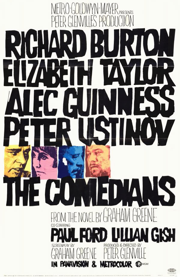
This month’s poster was inspired directly by one in particular – The Comedians.


I’d love to wax rhapsodic about my sentiment for this movie, my excellent taste in Graham Greene novels, or my admiration for the poster artist. But the truth is I’ve never seen the movie (and would rather stare at this amazing poster art for 90 minutes than watch a movie, even with a stellar cast like this), I’ve never read the novel, and I am unable to find out who the artist was (meager research points to Mitchell Hooks maybe?). But damn if that’s not a compelling poster.
We felt like the format fit this month’s Culprit Sessions well – the handlettering is nice and organic, as is the layout, and the thumbnail portraits fit the wish to include the DJs on the poster. And many, many kudos to the photographers (at least one of them is Terrence Patrick, whose work I’ve been lucky enough to have access to before) who shot great press photos and made my life much easier.
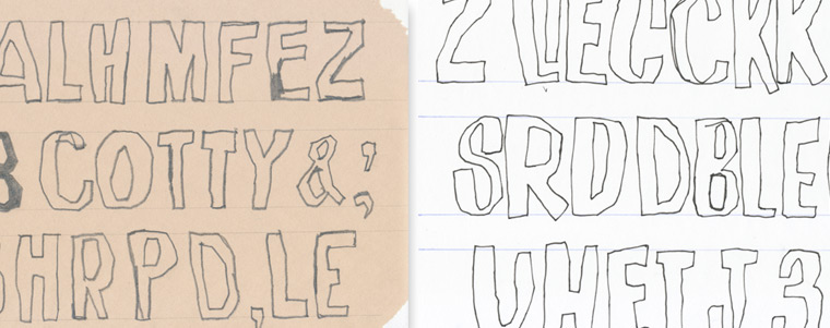
First – the handlettering. And kids – take it from me – do not try this at home. Cut corners, use boring digitized typefaces, and never try to hand draw your own letters. It takes forever! Always take the easy way out. Do as I say, not as I do.
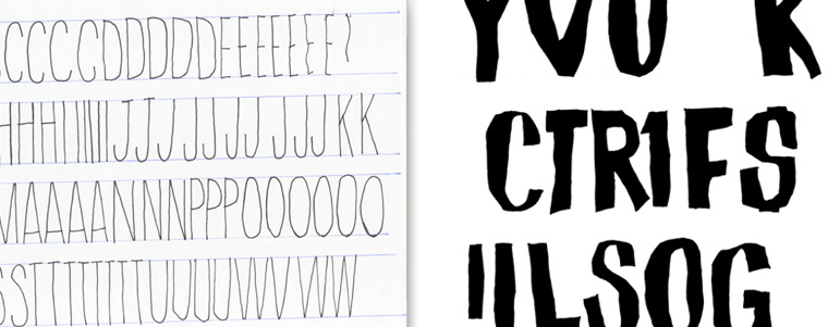
I started with a carpenter’s pencil on newsprint to go for a really rough, scratchy edge. It made for a nice way to inform my hand how to jaggedly block out the letters, but the edge was too fuzzy. So I gave it another go with a Micron pen on Graphis 360 layout paper, and that produced a better result. You’ll note that I built alphabets instead of just writing out the artists names and other words. It looked to me like that’s how the artist that made the Comedians poster made theirs, possibly by cutting out brushed on paper letters. So I made mine piecemeal in kind.


Then treating the photos. Much easier.


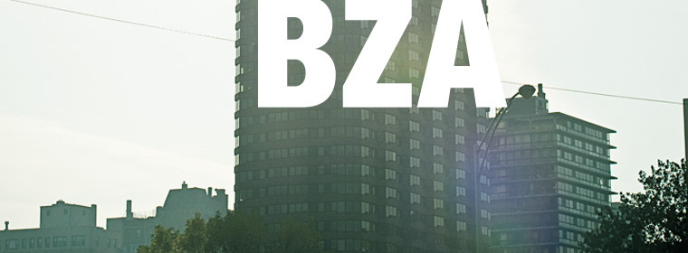
Then throw everything together.


