Very excited for this one! Nicolas Jaar is a 21 year old wunderkind of sorts. The music he’s making is well beyond his years. I’m anxious to see what a live set will be like.

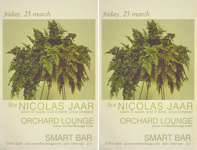

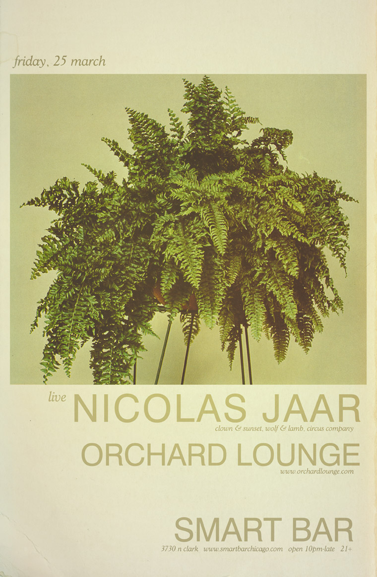
Very excited for this one! Nicolas Jaar is a 21 year old wunderkind of sorts. The music he’s making is well beyond his years. I’m anxious to see what a live set will be like.


As I previously mentioned, Lee Foss, half of Hot Natured, makes for a great art director. And it’s a good thing. I nearly turned Jamie Jones and him into Chicago-style hot dogs.
Instead, we continue with the evolution theme. Hot Natured paper makes way for assembly line robots.

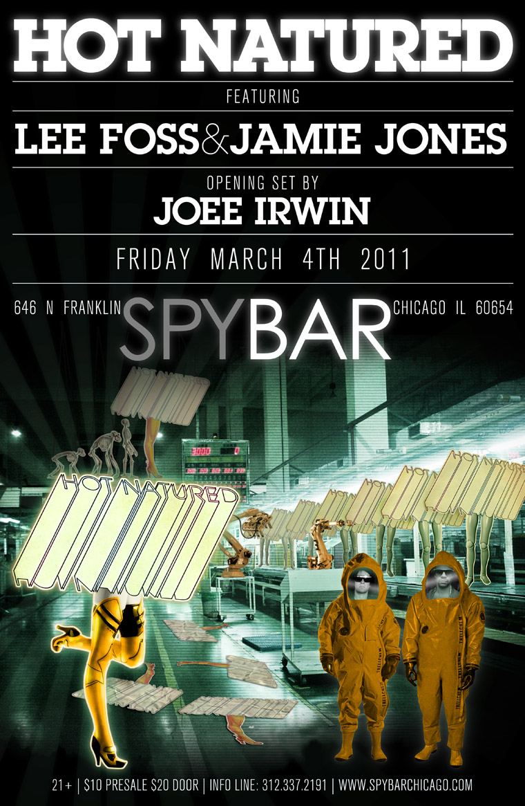


I love making Hot Natured posters. For one, the stuff that Lee Foss and Jamie Jones put out is super fantastic. What’s more, they’re both brilliant at coming up with absolutely ridiculous art direction (Lee especially). There’s always a good amount of taking the piss, and a great sense of humor.
2009:


2010:


In 2011, the party is taken deckside on a Hot Natured yacht. Pulling dolphin water skis. With a neon laser rope.


Here’s the latest release from the Culprit label – Lee Curtiss with Candy. The brief called for something a little crass, a little class, and with a vintage LA patina. The photo of Mr. Curtiss came from Terence Patrick, a massively talented LA photographer and Culprit co-conspirator. Definitely have a look through his impressive body of work.


The initial inspiration for type design came from advertisements from a 1974 smut rag. I randomly populated the ads with Lee’s name, the track title, and a repeated lyric (“what we talk about”).


These elements ended up lending more ‘ambiance’ than actual ‘information’, but served as great inspiration. The washed out colors and grainy textures of the final image came from pictorials in the same smut rag the ads came from.


This was a fun one to make. I wanted to try and match Diplo’s swagger in mashing up disparate styles and putting them together in a slick package. So I went with a literal take on that idea, and here is Diplo bringing his styles, slung coolly over his shoulder.


Nicolas Jaar Gig Poster - […] I’m not sure if this is a real gig poster of if it was designed by a fan (James Cullen who’s Flickr you can see here), but I did a quick google search which also brought up the second gig poster that I also like.Via: Flickr & BZA […]